|
Business Card Basics: Be Clear
And Consistent With Your Brand
 By Peter K. O'Connell By Peter K. O'ConnellVoice Actor
November 21, 2010
I just redesigned my business cards, and want to share five things I learned.
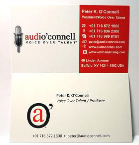
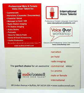
Take a look at the front and back views of my old (on top) and new (bottom) cards, and see if you agree.  WHAT I LEARNED ... WHAT I LEARNED ...1. Be consistent, you moron!
The old cards didn�t really match the overall look and feel of my branding. I know better than this, so how could I be so dumb?
2. Less is more, because the old more was unreadable!
 It was a few years ago, and I thought every detail of my business had to be on one card. It was a few years ago, and I thought every detail of my business had to be on one card.But all that stuff basically confused the heck outta people or made the card unreadable and useless. Not good.
3. White space is your friend!
Font vomit and logo diarrhea are not your friends, yet the old card had both of them and none of the white space. Ya gotta give people�s eyes room to read and even relax a bit with a card. They�ll probably retain more info that way.
I'm still not sure if the main logo and the secondary logo will throw people off, or if it won�t matter much to anyone.
4. Oh, you do voice overs, too?
Somewhere in the old card, you might be able to tell that the president of the company may have, at one time in his career, actually performed voice overs himself. In the new card, especially on the front, that should be clearer now.
Titles are for suckers, and it appears at one time I was a sucker for titles.
5. If you are creative, show it!
It took me some time, but on the back I created a design to show the company, everything the company offered, and tied in the logo all without making people�s eyes bleed. Extra points: In a year or so, I�ll do another article on how I have come to hate my new card design, too.
WHAT DO YOU THINK?
Now these are my takeaways, but your opinion on the old versus new business card may be vastly different. What do you think? Please share!
ABOUT PETER ...
Peter K. O�Connell has been a professional voice talent since 1982 and is president of audio'connell voice over talent. His company provides English-speaking professional male and female voice-over and audio production services for national and international clients. The voice-over needs of foreign-language clients are served through another O'Connell-owned company, International Voice Talents. He also operates Voice Over Workshop, which provides professional voice-over training to novice and experienced voice talent worldwide, is author of The Voice Over Entrance Exam, an e-book that examines the business and performance realities of becoming a voice-over talent, and writes a very informative blog on voice-over marketing and advertising, voxmarketising.
Email: peter@audioconnell.com
Web: www.audioconnell.com
Blog: www.voxmarketising.com
|
|
|
Inspiring interviews help your VO career
Email alerts to new VoiceOverXtra articles
Get your bi-weekly dose here ... all things VO!
With Sean Daeley and Paul Stefano - check it out!
As of the NEW website launch, 03/22/2012


Is the old card really the one on top? To me, the card on top is easier/faster to get your message. The logo on the top card doesn't work, though, because nothing on that side of the card ties in with it and by itself, it's not instantly recognizable with any particular meaning.
The bottom card has too much info. Although I can't read most of the text on this web image of it, I'm almost expecting to see a listing including small appliances and cell phones. You're trying to make an introductory business card into an all encompassing marketing piece - something much better suited to a brochure. My initial impression when I have received cards from people that list many skills or jobs they perform, is this person is trying to make a buck any way they can and they're probably not great at any of them.
The top card promotes YOU as a brand better than the bottom card. I don't know if the bottom card is promoting you alone, or promoting an agency which has several voice actors. People who want you to do voice over don't need or want to hear about you putting on voice over work shops do they? They just want to be confident in your ability to do the work professionally, on time, within budget.
I would use your business card for just the basic important info and to get people to go to your web site. You've done a great job there of providing all your info in a much less crowded space with a logical layout that's easy to navigate.
Most people, that I know, and I have to admit I'm 60+ years, never even look at the back side of a business card, me included.
Frankly, I've always felt if you can't present who you are and what you do in six lines or less on a standard-sized business card you're presenting nothing more than hype.
I may be old school, but multicolor, bleed-thru backgrounds, multiple lines of print so small I can't read immediately turn me off.
A simply printed, black on white, business card on quality stock, easily readable type, and maybe, with an embossed edge will significantly impress me more than anything else. To me, a card like that tells me the person is quality conscious and proud of what they offer.
That's my take on business cards. But what do I know? I'm an old fogey.
J. Russell
Second, thanks to all the commentators, I appreciate your opinions. I've always tried to subscribe to the notion if you're not making mistakes every now and again, you're not doing it right.
@Linda: I will bring the new cards and you'll see that the weight and finish of the card stock is better than what I had. Card stock and finish was probably as big a deal for me as design. I hate flimsy cards.
@Mick: Thank you and not surprisingly, I agree with you. Part of my branding needs to speak to the artistic sensibilities of those people who buy my product ... often producers and creative directors who appreciate style and NOTICE it. It shapes their world. The challenge is to create a style that is not overpowering. Not sure if I got it perfect. Time will tell.
@Paul: you know Paul, surprisingly the cost of the card wouldn't have been too drastically affected as long as I didn't add embossing or foils or letterpress, etc. And as I noted to Linda, the card stock was better with these cards and they cost much less than the last ones ... online printing ... it works (although I had some missteps some months ago with a printer, so online printing ain't perfect either.
@BP: I don't disagree with you, except to say I think a card should give all the contact information ANYONE could possible want because in our business,we deal with soooo many different types of prospects and clients.
@Alan: I have to disagree that a card doesn't have to be an attention-getter. Yes, the client wants to hear your sound, and certainly your printed image has to be buttoned up as a business communication tool. BUT I believe EVERY business needs to try and stand out in all channels of their marketing, and that includes cards. My card now matches my web look and feel. And watching people read the new card, you almost see them relax at how easy it is to discern the information. Further, they seem to respond to the graphic vibe. Every little bit helps. But I do value your insight, thank you.
@Brian, you hit on the one concept I'll debate for a while: The main logo versus the secondary logo. I'll bore you with some background now (you asked for it).
The main logo represents the company and lets folks know that I am more than just a voice talent ... I am a full voice talent production company. Well, along came social media and the full logo didn't fit as an icon in many of the tools like Twitter et al, where I branded my company. I also was making some logoed hats and the embroidered full logo didn't look so hot. Then I needed to create a favicon for my website and at 16 pixels, the big logo wasn't going to work. Hence a secondary logo. People seemed to like it.
Fast forward (try to keep up here would you ;)) to the new cards, where I did need to better market myself as a voice talent and a company (the company was slightly overshadowing my VO work on occasion). I wanted to have a place for the secondary logo because many folks only knew that icon while others knew the full icon.
In the end, we'll see how this all flushes out among the great unwashed public. It's a lot of fun to go through the process, I think.
My best always to you all,
- Peter
In my humble opinion, I like the simplicity and clarity of your new card. I checked out the business card you gave me a while back, it is definitely the old one. When I see you in NYC in December, bring along the new one to share!
Best,
Linda
I found Alan's comment interesting, though. As communication implies more than simply the literal. In fact, I would argue that stripping all sense of "art" from a business card actually conceals information from a potential business contact. If I were handed a business card and all I saw was a name and vocation in black & white Arial font, that would leave me with a number of questions ... what kind of VO does he/she do? what type of voice did they have?
Often pictures or icons or images (used sparingly and effectively) help in the memory process. The opposite, is essentially giving your potential business connection a "poker face."
That said, Alan's been around a while, so perhaps his need for design is trumped by his professional reputation.
*I made a fun little graphic to accompany my previous point: http://gallery.micklauer.com/dump/does-design-matter.jpg
In all, I find Peter's new card to be a nice minimalist balance of clarity and color. It has a very clean commercial feel :)
Great post! As a visually challanged artist, I'm very aware of a simple card. Also, a simple card is better for the bottom line!!
Paul
My name; a "branding picture logo" with the the branding phrase under the picture: "Americas' Heartland Voice"; my website address and phone number. That's it.
I believe it's important to lead people to your "website," where all additional information can be obtained. If they are even remotely interested in you, they'll at least visit your website, where your advertising hits pay dirt, or not.
I hope to catch the producer's attn with my demo and my audition ... not my card.
It's a Business! Only the actors think it's Art. Everyone else realizes it's a Business.
Also, you need to consider "positioning': the competitive quality that sets you apart within the VO market. Your biz card should give a reason to call you beyond the VO basics. Consider whether your present (new) back of the card should be the front. On the reverse, present those reasons to call ...